More WesLive updates

A quick update on a couple of small changes to WesLive:

Updated header style
  1. Based on feedback we’ve received from on- and off-campus visitors to and users of WesLive, the post header style has been modified from white text on a black background to red text on a white background. Hopefully this change will make the page more usable and pleasing to a majority of our visitors. Thanks to all who provided feedback.
  2. The “AddThis” feature has been enabled. Each post now has a link at the bottom that says “Bookmark”. When you hover on the link you are presented with the option to “bookmark and share” the post by a variety of means, including e-mail and popular social sites. Note that this feature requires that JavaScript is enabled in your browser.

Thanks for using WesLive!

Resources Links Updated

In response to user feedback we have updated the “Resources” links in the global navbar to include the Library. To accommodate the additional link we have shortened “Offices & Services” to Offices. The color has also been changed to a lighter grey, increasing the contrast of these links, to make them easier to notice.

Resources before
Resources before
Resources after
Resources after

We appreciate your feedback. Thank you for helping us to improve the site.

Before and After: A quick look at the changes

This post presents some before and after shots for reference as well as some notes on the changes.

Overall:

  • the old design was 760px wide while the new is 960px
  • the top navbar has been changed to accommodate a greater number of links and to stay open until you close it
  • there is a consistent footer on all new pages
  • pages in the new design are running under the Cascade CMS

The homepage

Before
Before
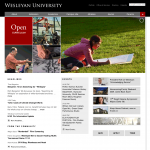
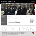
Homepage after (navbar closed)
After (navbar closed)
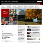
After (navbar open)
After (navbar open)

The previous homepage had three changing content areas (Gallery, “Belt” buttons, and Headlines). The new homepage adds three more: “Differentiator” squares, Events and From the Community, and the Belt has been converted to a Highlights section. The universal navbar also applies to the new homepage; it appeared on the previous homepage in a highly modified form, with no drop down.

About Wesleyan

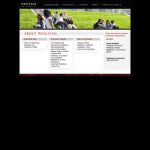
About before
Before
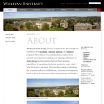
About after
After

Landing pages such as About now have a narrative focus with the lists of links moved into the left navigation. This layout shows the basic form of new pages: the topbar, header graphic, left navigation, central content space, related links column, and a standard footer at the base of the page.

Admission

Admission before
Before
Admission after
After

Admission landing page

Admission landing before
Before
Admission landing after
After

Alumni

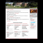
Alumni before
Before
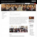
Alumni after
After

Parents

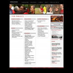
Parents before
Before
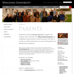
Parents after
After

New pages

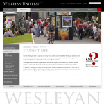
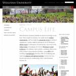
Campus Life
Campus Life
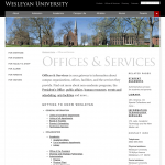
Offices & Services
Offices & Services

Footer

The new footer
New footer

New site rollout begins tomorrow

The following message was sent to the campus community this morning.

From: announcement@wesleyan.edu
Sent: Wednesday, November 11, 2009 9:27 AM
To: Wesleyan Campus Community
Subject: Wesleyan’s New Web Site

Dear Members of the Wesleyan Community,

Tomorrow, University Communications and ITS will launch the redesigned Wesleyan University homepage, Admission web site, and several major landing pages (About, Academics, Campus Life, Alumni, Parents, and Offices & Services). At this time, these are the only pages that will be changed to the new look. This begins a major transformation of the Wesleyan web site that is expected to continue throughout 2010. All departments and sub-pages will be converted to the new design and content management system (CMS) over the coming 12–18 months.

The new design features significant improvements in navigation and content presentation. Also, the new Cascade content management system promises new capability within your department to develop, maintain and update content on your pages. ITS is pleased with the performance of this new system and we think you will be pleased, also. If you need help with navigation, please use the Search Box at the upper right portion of the screen.

We invite you to check the ‘From the Community’ section of the homepage. This new feature offers content from the new Wesleyan Community Blog. Anyone with a Wesleyan username and password is welcome to post and comment. Check it out at http://community.blogs.wesleyan.edu!

Join us in making Wesleyan’s online presence open, vibrant, and engaging.

University Communications & Information Technology Services (ITS)

Redesigned Wesleyan web site launch

The following message was sent to the campus community this afternoon.

From: announcement@wesleyan.edu
Sent: Thursday, November 05, 2009 3:01 PM
To: Wesleyan Campus Community
Subject: Redesigned Wesleyan Website Launch

The redesigned Wesleyan University homepage, Admission web site, and several major landing pages (About, Academics, Campus Life, Alumni, Parents, and Offices & Services) will be launched on Thursday, November 12. These pages are only the first to be changed to the new design. This begins a major transformation of the Wesleyan website that will continue throughout 2010. All departments and sub-pages will be converted to the new design and content management system over the coming 12–18 months.

University Communications and ITS

Survey results

Thank you for participating in our web redesign survey. We received over 1,000 responses! Thanks also for providing thoughtful comments and suggestions through our webform and blog. This information has guided us through the design process.

The survey provided important insights about behaviors, expectations, and desires for the new Wesleyan website with input from each of our main audiences. We ran two versions: one for prospective students and their parents (which we’ll call “prospectives”), another for the Wesleyan community including current students, faculty, staff and alumni (which we’ll call “community;” sometimes we will distinguish “alumni” as a separate group owing to their large numbers).

Below is a summary of our findings. Visit the redesign site for in-depth commentary and data about the prospective community, campus community, and alumni.

Navigation

Simplicity. Participants from every audience expressed a strong desire for a simple navigation, requesting that the menu system be clear, easy, intuitive, user-friendly, well-organized, and straightforward. Many participants noted that navigation is the “most important element to redesign.” There was a strong preference among all participants for sublinks to be revealed on-click or hover.

Survey results indicated that prospectives are more likely to use navigation menus on the website, while members of the community are more likely to be looking for specific information and use the search box. Prospectives and community members identified similar, though not identical priorities. Differences were in the range of what we expected given people’s varying familiarity with the site. [read more about Navigation]

Photography

Photos! It was clear through both the survey questions and comments from prospectives and the community that photos are important, and that integrating them into the homepage is essential. Most prospectives and community participants prefer photo slideshows. Requests for interesting, excellent, and large photos were consistent. Some had additional suggestions that the visual content include student artwork, 360-degree photos, historic images, and construction/renovation projects specifically. [read more about Photography]

Design

Dignified and usable. There was a strong request for a clean, simple, uncluttered and visually appealing site among survey participants. Along with requests for a site that was classy, dignified and elegant, people hoped for something that was also welcoming and friendly. [read more about Design]

Spirit

A “Wesleyan” energy. Prospective students talked about the role of a college website as a first and lasting impression of the university. The community echoed this sentiment by expressing a desire for the site’s design to be unique and to reflect the spirit and character of Wesleyan. Both groups of participants noted important role of the website in not only distinguishing Wes from other liberal arts colleges, but also in reflecting the creative energy and spirit that defines us. [read more about Spirit]

Additional points

In addition to these main themes, the following topics were also highlighted in the comments:

Last day to take the survey!

We will be closing our first web redesign survey at the end of the day today, May 5th. We have had excellent results so far from over a thousand participants and we are so grateful for your thoughtful feedback. Thank you! We are busy reading all of your comments and tallying the results as we incorporate our findings into new design work.

Look for a new post in the coming days where we’ll share results for both the prospective student/parent and Wesleyan community surveys!

If you haven’t taken the survey yet today is your last chance! Of course, we welcome your feedback here on the blog as we continue our work.

http://www.wesleyan.edu/redesign/survey/

Thank you,
The Web Design Team

Web Page Design Concepts Critique

Hello Everyone,

Thanks for all of your feedback so far. This is a challenging and exciting project and your input is a key part of the process.

For the past several weeks, the web redesign team has collaborated on three concepts for the homepage and a few landing pages. We are inviting you to critique our design sketches and offer suggestions. Concepts A, B, and C are works in progress, and with the help of this blog and several other focus groups we plan to narrow down a design direction by April 30.

http://www.wesleyan.edu/redesign/presentation.html

It will help if your comments address design, content, and navigation. Keep in mind that our primary target audience (for the homepage) is prospective students and their parents. We look forward to your point of view.

Thanks for your time.