This post presents some before and after shots for reference as well as some notes on the changes.
Overall:
- the old design was 760px wide while the new is 960px
- the top navbar has been changed to accommodate a greater number of links and to stay open until you close it
- there is a consistent footer on all new pages
- pages in the new design are running under the Cascade CMS
The homepage


The previous homepage had three changing content areas (Gallery, “Belt” buttons, and Headlines). The new homepage adds three more: “Differentiator” squares, Events and From the Community, and the Belt has been converted to a Highlights section. The universal navbar also applies to the new homepage; it appeared on the previous homepage in a highly modified form, with no drop down.
About Wesleyan


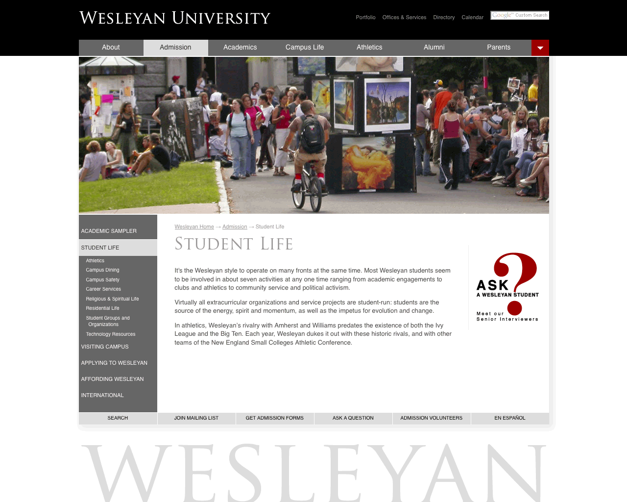
Landing pages such as About now have a narrative focus with the lists of links moved into the left navigation. This layout shows the basic form of new pages: the topbar, header graphic, left navigation, central content space, related links column, and a standard footer at the base of the page.
Admission


Admission landing page

Alumni


Parents


New pages


Footer
